LOGO DESIGNING
Logo design tips from the pros

Great logo design requires a complex mixture of design skills, creative theory and skilful application. Any designer worth their salt can create a fit-for-purpose logo, but truly mastering all aspects of the craft takes time. Of course, logo design is just one small subset of branding, but the logo or brand mark remains the centrepiece of most branding schemes.
In this article, we bring you advice from branding experts to guide you in creating the best logo for your brand or product. We'll kick off with 10 golden rules from logo design specialist David Airey (this page), then move on to examine each element in more detail: research and strategy, typography, shape and symbolism, colour theory and finally using your logo design.
10 golden rules of logo design
When you think of a person who’s impacted your life, it’s almost certain that you can picture what he or she looks like. And so it is with the brands from which we often buy. We can easily picture the logo just by thinking about our experiences with the product, company or service.
Where there was once just a handful of companies operating within a particular market or niche, there might now be hundreds, maybe thousands, all competing for attention, all wanting us to look at them first. That creates increasing need for brands to visually differentiate themselves so they’re not confused with competitors.
That differentiation is achieved through brand identity design – a range of elements that all work together to form a distinctive picture in our minds. Depending on the company, the identity can include uniforms, vehicle graphics, business cards, product packaging, photographic style, coffee mugs, billboard advertising, and a raft of other items, right down to the font choice on the website.
It’s important to remember that when we look at something, we don’t read first. Before anything else we see shape, we see colour, and if that’s enough to hold our attention, then we’ll read. So in every instance, regardless of company, the small but essential element in the brand picture is the logo.
Our job as designers is to distill the essence of a brand into the shape and colour that’s most likely to endure, because visual appearance plays a critical part in forming a connection in our brains between what we experience and who we experience it with (the brand). In many respects, a company’s logo is akin to our loved ones’ faces.
When the right logo is aligned with an excellent product, and when it’s in place for a significant amount of time, it can eventually become a priceless asset for any company. The Nike swoosh, McDonald’s golden arches, the Michelin man, Mercedes’ three-pointed star, the Woolmark symbol – these are just a few of the more high-profile examples. But besides their ubiquitous nature, how do you give a logo the best possible chance of reaching a similar status? There are universal traits within every successful logo project, and I’ve outlined some here to help improve the quality of the marks you create.
01. Lay the groundwork

Logos such as Mercedes and Woolmark have become priceless assets for their respective companies
One of the most interesting parts of being a designer is that you get to learn new things with each new project. Every client is different, and even in the same profession, people do their jobs in many different ways.
To make it easier for consensus to be reached on your design idea, you need to ask your client the right questions from the outset: Why are you here? What do you do, and how do you do it? What makes you different? Who are you here for? What do you value the most?
Those questions might seem quite straightforward, but they can be challenging to answer, and they’ll lead to further questions about your clients’ businesses. What you discover in this phase of a project will help to determine the strongest possible design direction.
02. Treasure your sketchpad
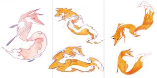
Sketches of Firefox mascots by Martijn Rijven, who was commissioned by Wolff Olins
Using a sketchpad is a chance to rest our eyes from the glare of brightly lit pixels that tend to dominate our lives. But more importantly, recording different design ideas can be much quicker when there isn’t a digital device between our hands and our brains. So if you wake in the night with an idea you don’t want to lose, the pen and paper by your bed is the ideal way to remember. Sketching also makes it easier to put shapes exactly where you want them – there’ll always be time to digitise your marks later.
When you’re describing design ideas to clients, prior to digitising a mark, it can be helpful to share a sketch or two, making it easier for them to visualise the outcome without distraction from typefaces and colours. Don’t share too much, though – only the best ideas.
03. Work in black and white
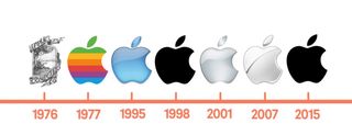
The inner detail of the Apple logo has changed over the years, but the silhouette remains
Leaving colour until near the end helps you focus your attention on the basics of the idea rather than something that’s much easier to change. A poor idea can’t be rescued by an interesting palette, whereas a good idea will still be good regardless of colour. Picture a well-known symbol. Think of it now. It’s the form we remember before the palette. It’s the lines, the shapes, the idea, whether that’s the bite from an apple, three parallel stripes, four linked circles in a horizontal line, or something else.
04. Keep it appropriate
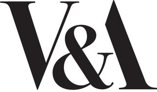
Pentagram founder Alan Fletcher created the V&A logo in 1989
A mark must be relevant for the ideas and activities it represents. An elegant typeface will suit a high-end restaurant more than it will a children’s nursery. A palette of fluorescent pink and yellow isn’t going to help your message engage with male pensioners.
Crafting a mark that bears some resemblance to a swastika, regardless of industry, isn’t going to work. You know these things. They’re obvious. But it goes a little deeper. The more appropriate your rationale behind a particular design, the easier it becomes to sell the idea to a client. And that can often be the most challenging part of a project. Designers don’t just design. They sell, too.
05. Aim for easy recall
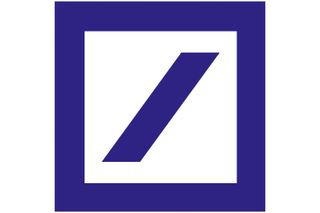
The 1974 Deutsche bank logo by Anton Stankowski
Simplicity aids recognition, especially when so many brands are competing for our attention. You want to give onlookers the opportunity to recall a mark after just a quick glance, and that’s not possible with an overly detailed design. A trademark has to be focused in concept – have a single ‘story’ – and in most cases must be uncomplicated in form. This is because it needs to work at a variety of sizes and in a range of applications, from a website icon in a browser bar to signage on a building.
06. Strive for difference

The 1999 Tate logo by Wolff Olins united the Tate’s four galleries across the UK
When your clients’ competitors are all using a particular typographic style, or the same kind of palette, or a symbol placed on the left of the brand name, do something different. It gives you the perfect opportunity to set your clients apart rather than have them blend in.
But so much similarity in the marketplace doesn’t necessarily mean your job has become easier, because it takes a brave client to buck the trend. By showing imagination in your portfolio, you’re on your way to attracting the kind of client you want.
07. Consider the broader identity
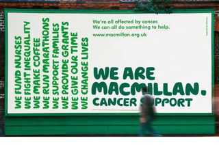
Wolff Olins created a new typeface for macmillan cancer support in 2006; part of a wider repositioning
It’s rare when you see a logo in isolation, on its own without the context of a website or business card or drinks menu or app icon. That’s why a client presentation needs to encompass a variety of relevant touchpoints to show how a logo appears when seen by potential customers. It’s a little like when you’re stuck in a rut – it can help to step back, to look at the bigger picture, to see where you are, what you’re surrounded by.
In design terms, the bigger picture is every potential item on which a client logo might appear. But always consider how the identity works when the logo isn’t shown, because while important, a symbol will only take an identity so far. One way to achieve cohesive visuals is to craft a bespoke typeface that’s not only used in the logo, but that’s also seen in marketing headlines.
08. Don’t be too literal
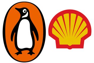
The logos for Penguin and Shell don't give any clues as to the types of company they represent
A logo doesn’t have to show what the company does, in fact, it’s better if it doesn’t, because the more abstract the mark, the more enduring it can become. Historically you’d show your factory, or maybe a heraldic crest if it was a family-run business, but symbols don’t show what you do. Instead, they make it clear who you are. The meaning in the eyes of the public gets added afterwards, when associations can be formed between what the company does and the shape and colour of its mark.
09. Remember symbols aren’t essential

Johnson Banks’ 2004 wordmark for shelter – with its pitched roof ‘h’ – helped reposition the housing charity
Often a bespoke wordmark will do the job, especially when the company name is unique, such as Google, Mobil, or Pirelli. But a version of the logo that works in small confines will always help. That might be as simple as lifting a letter from the name and using the same colour, or it might incorporate a symbol that can be used as a secondary design element (wordmark first, symbol second) instead of as a logo lockup where both pieces are shown alongside one another.
Don’t be tempted to overdo the design flair just because the focus is on the letters. Legibility is key with any wordmark, and your presentations should demonstrate how your designs work at all sizes, large and small.
10. Make people smile

Designed in 2000, turner Duckworth’s wordmark for Amazon adds wit with a hidden smile that goes from A-Z
Injecting some wit into the work will not only make your job more fun, but it can help your client to become more successful, too. It won’t be appropriate for every profession, such as weapons manufacturers and tobacco firms, but whether you choose to work with those companies is another thing. The somewhat less contentious law and financial sectors are filled with companies identified by stuffy and sterile branding, putting some humour into the identity for such clients is one way to set them apart.
There’s a balance, though. Take it too far and you risk alienating potential customers. But regardless of the company, people do business with people, so a human, emotional side to your work will always have a level of relevance.


Comments
Post a Comment